Feature explorer

The feature explorer is a tool used to visualize your dataset’s features. Note that features are the output of your processing block, and not the raw data itself (see here for the data explorer, which performs a similar function on your raw data). This visualization helps you identify outliers and how well your classes are grouped and separated. A good separation among your classes usually indicates that simpler machine learning (ML) models can be used with greater accuracy.

Using the feature explorer

To access the feature explorer, go to the Processing page in your project. The name of this page depends on which processing block you used, such as Raw, Flatten, Spectral analysis, and so on.

On the processing page, configure your processing block and click Save parameters. You will be automatically transferred to the Generate features tab. From there, click Generate features and wait while your raw data is transformed into features.

If you are using the Flatten processing block, you will see a 3D representation of up to 3 axes from the features generated in that block. You can select which axes are shown by selecting them from the drop-down menus above the plot.

Other processing blocks (e.g. Spectral analysis) use a process known as "dimensionality reduction" (see the next section for more information). It essentially compresses all the information found in your features (which can be hundreds or thousands of dimensions) into two dimensions. This compression makes it much easier for our human brains to comprehend how the samples relate to each other: how they are clustered and how much distance there is between samples with different labels.

You can click on a dot in the plot to learn more about that particular sample. In both 2D and 3D plots, you can click and drag to move the plot as well as zoom.

Note that if you create your own custom processing block, you can determine if and how to display a feature explorer plot in your project.

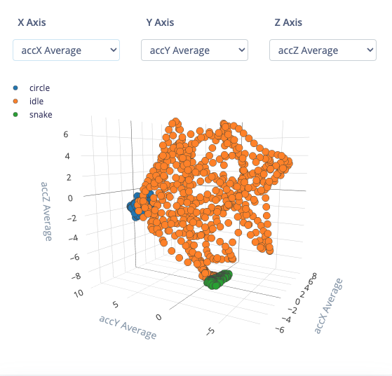
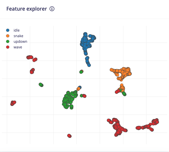
Understanding the feature explorer

he feature explorer is an incredibly useful tool to help you analyze your dataset, your feature extraction (processing) method, and how well you should expect a machine learning model to classify new samples. We will use our example above, which consists of the spectral analysis features extracted from the continuous gestures dataset to help you get started.

First, notice that the samples fall into one of four categories: idle, snake, updown, and wave. These categories come directly from your label names for that dataset. Each sample is represented by a dot on the plot, and the color of that dot corresponds to its associated label. Note that if you have time series data, each window corresponds to one sample.

In the ideal case, you would see all the samples in each category in its own grouping separate from other clusters of samples. If that is the case, then you have a very good processing block, and your machine learning model can often be very simple.

Take a look at the grouping with the 1 annotation in the example above. A model (after "training" or "fitting" the model to this dataset) would likely have a very easy time identifying samples in this group. As a result, you can expect a high accuracy for idle samples.

If you look at the 2 group, you can see a lot of overlap among samples that belong to several categories. ML models will often struggle when samples are ambiguous like this. They will have a hard time differentiating among the samples, and you can expect lower accuracy among those groups.

If you see good separation among your class groupings, you can expect good model accuracy, and you may even be able to get away with a simpler model architecture (e.g. fewer nodes per layer, fewer layers). Be cautious of under- and over-fitting when training your model; always check its accuracy with a validation or test dataset!

If your entire dataset looks like the number 2 grouping above (all samples overlap, and it's difficult or impossible to distinguish the groupings), then you might need to take some actions to make your features more separable. Here are some things to try:

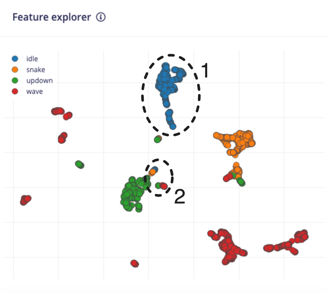
  • Collect more data. This will sometimes help flesh out more distinguishable clusters in your features.

  • Try a different processing method. You might need to change how your features are extracted. Spectral analysis not working? Try a spectrogram. Grayscale images create overlapping features? Try using color (RGB) instead to see if the extra information helps separate the groupings.

  • Try different processing parameters. Play with the feature extraction settings in your processing block to see if you can create better groupings.

  • Use a more complex ML model. If you feel you have tried your best to get the features to separate into clusters but there is still a lot of overlap, then you might need to rely on your ML model to perform the separation for you. Often, this means using more complex models (e.g. more layers, more nodes). As before, be aware of under- and over-fitting as you tweak your model's hyperparameters.

The EON Tuner is a great AutoML tool in your arsenal to help you design a good impulse. It will automatically try different combinations of processing blocks with different settings along with various ML models to find a good pipeline of feature extraction and ML model.

How does this work?

With the Flatten block, the points are drawn in a 3D space with the value for each axis coming from one of the features. For example, let’s say you chose average acceleration X, average acceleration Y, and average acceleration Z as your axes, and a sample had the following values for those features:

  • Avg accX = -0.24

  • Avg accY = 0.17

  • Avg accZ = -9.81

A dot would be plotted at (-0.24, 0.17, -9.81) in the 3D viewer. Note that the usage is the same as the 2D viewer: we want to visualize the groupings and separation among classes.

For other blocks, dimensionality reduction is the process of transforming data from a high-dimensional space to a low-dimensional space while retaining as much meaningful properties of the original data as possible. Popular algorithms for dimensionality reduction include PCA and tSNE.

Dimensionality reduction has a number of uses, including data compression, speeding up learning algorithms (as fewer dimensions often means smaller models), and noise reduction. The feature explorer tool in Edge Impulse uses dimensionality reduction to create a data visualization plot to help you understand how your data and features are grouped.

The feature explorer uses the Uniform Manifold Approximation and Projection (UMAP) algorithm to perform dimensionality reduction. The math behind UMAP is quite complex, but it essentially involves constructing a graph in the higher-dimensional space that connects similar data (sample) points to each other. This graph is then projected onto a lower dimensional space (2 dimensions in the case of the feature explorer) to create the final output. This blog post does a great job of explaining how UMAP works in more detail.

Questions?

If you have any questions about the feature explorer, we'd be happy to help on the forums, or reach out to your solutions engineer.

Legacy 3D feature explorer

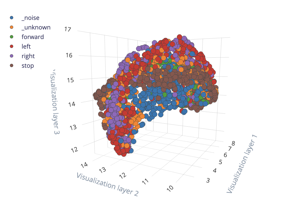
Older versions of Edge Impulse used a 3D viewer with UMAP on non-Flatten blocks. This legacy feature explorer accomplished the same goal of performing dimensionality reduction to provide a visual representation of your extracted features. Because 2D images load faster on web pages than 3D models while retaining much of the same information, we switched to 2D images. However, if feature extraction was performed prior to this switch, some projects may still have 3D feature explorer plots.

Last updated